Writing for different digital media channels can be challenging. This is due to the different way people read websites and other digital channels compared to traditional print media. According to research most users only scan web pages rather than reading the content word-for-word so this requires a different writing approach to grab the reader’s attention and relay the information quickly.
Example 1 – Blog Post
The content management system (CMS) where the blog will be published needs to be considered as it can affect your copy. The layout may dictate the size of area you wish to use and you may need to keep the text short to prevent your readers from scrolling endlessly. When writing a blog it is also important to convey the subject of the post quickly so the title must be large and clear.
In the Converging Technologies blog post below I use short paragraphs and include images to break up the text. This helps to grab the attention of the reader and encourage them to read further. Keywords were included throughout the text to increase the likelihood of the post appearing in search engine results.

Example 2 – Online CV
When writing for a CV that will be posted online it is important to make the layout clear with the important information easy to find. In the creative CV example below I used icons to clearly show my contact information and I added a graphical representation of my skills to reduce the amount of text needed and to increase white space. This helped to create a clear and simple design and I also used imagery and colour to help grab the reader’s attention. The language used is generally less colloquial than a blog post yet also needs to be concise.

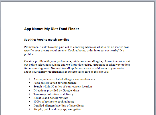
Example 3 – App Description
When writing an app description there are limitations as to how much text can be used due to where it will be displayed. In the example below the promotional text is limited by how much will be seen by the reader without them clicking the ‘see more’ option. It is important to get the message across about the purpose of the app and why the user needs it in the first 170 characters to encourage them to read more. The use of bullet points helps to highlight the main features of the app without the need for reading lengthy text.